
Frameworks
The GHG Protocol in 2026: What's Changing in Carbon Accounting, and What It Means for Issuers
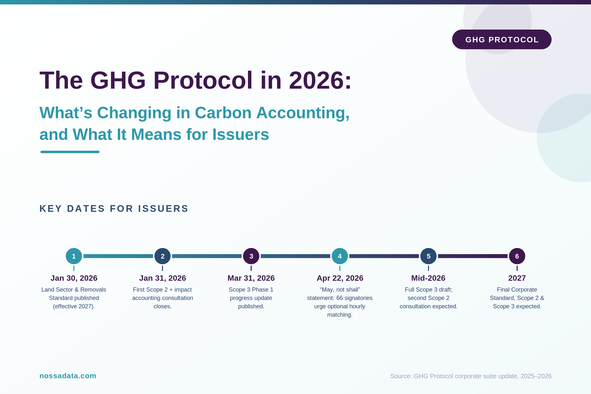
An overview or issuers about what is changing in the GHG protocol and how it may affect them.
I have looked at hundreds — if not thousands — of annual reports over the years since I founded the ESG Start-up Nossa Data. Across all of them, the difference between a report that works and one that frustrates everyone who opens it rarely comes down to the writing or the design budget. It comes down to a handful of practical, easily fixable decisions about how the document is built, named, and published.
Your annual report has a job: to let stakeholders find data about your company. Investors, analysts, ESG raters, journalists, and — increasingly — the AI systems those people rely on all need to pull information out of it quickly and accurately. The moment your report makes that harder than it needs to be, you lose control of your own story. People either give up, or they capture your numbers wrong and compare you on bad data.
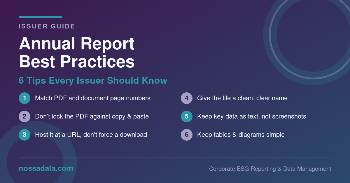
The good news is that the most common problems are also the easiest to fix. Here are six best practices every issuer should know.
This is the single most common annoyance, and it is entirely avoidable. When the page number printed on the page (“page 42”) doesn’t match the page number your PDF reader shows (page 47 of 180, because of cover pages, blank spreads, and front matter), every reader who follows a cross-reference, a table of contents entry, or a citation lands in the wrong place.
Analysts cite your report by page. Raters reference specific disclosures by page. If “page 42” in your contents isn’t page 42 in the file, you have created friction on every single lookup. AI also doesn’t know which of these 2 numbers it should use. Align your PDF page numbers and report page numbers and life will be easier internally and externally.
It is surprisingly common for issuers to publish an annual report with copy protection or text-selection disabled. The instinct is understandable — it feels like protecting your content. In practice it does the opposite of what an annual report is for.
The purpose of an annual report is to let stakeholders find and use your data. When you lock the file, an analyst can’t copy a figure into a model, a rater can’t lift an exact quote, and anyone working at speed simply moves on or re-types your numbers by hand — introducing errors that get attributed to you. Leave the document open and selectable. You want your data to be found and positioned accurately.
Give your annual report a stable, public web address that opens directly in the browser. Requiring users to download a file before they can read a single line adds a step, discourages casual readers, and creates dead ends when the link is shared.
Hosting at a clean URL also helps the report get discovered and indexed, keeps you in control of final version, and lets you see how people engage with it. Make downloading easy and obvious for those who want a local copy — just don’t make it the only way in.
The version you upload to your site should be named something a human can read and trust at a glance — for example, Company_Name_Annual_Report_2025.pdf. Not ARv7_FINAL_final_print-ready_2_compressed.pdf.
Messy file names look unprofessional, but the real cost is practical: the file name is often what gets saved, cited, shared, and surfaced in search results and AI tools. A clean, consistent naming convention (company, document type, year) makes your report instantly identifiable and easy to find again next year.
When your most important figures — quantitative tables, KPIs, emissions data — are embedded as flattened images or screenshots, you force every reader and every machine to run OCR just to read your own data. OCR is imperfect: it misreads digits, drops columns, and scrambles tables. You are quietly introducing errors into the exact numbers you most want people to get right.
Keep key information as real, selectable text. Charts can stay as images for visual appeal, but the underlying numbers should also exist as machine-readable text in the document so they can be captured perfectly the first time.
Most people (and computers) who open your annual report are also going to open dozens — if not thousands — more. They are comparing you against peers. The easier your content is to parse, the more accurately you get captured and the more fairly you get compared.
Favour clean, conventional data tables over elaborate infographics. Use straightforward diagrams instead of dense, stylised visuals that look impressive but resist extraction. Complexity that delights a designer often defeats the analyst and the algorithm. When your content is captured accurately, your numbers speak for themselves — which is exactly what you want.
Every one of these tips points in the same direction. Your annual report is no longer just read by people who turn pages start to finish — it is mined, queried, and benchmarked by analysts, raters, and AI tools working at scale. Reports that are open, clean, well-named, text-based, and simple get captured accurately and compared fairly. Reports that are locked, messy, image-heavy, and over-designed get misread, skipped, or scored on bad data. None of this requires a bigger budget. It just requires building the document with the reader — human or machine — in mind.
Nossa Data is an expert in reviewing and scraping annual reports from companies globally. We are happy to go over a review of your annual report for free via an intro call. If you are interested get in touch at solutions@nossadata.com and say “Annual Report Assessment.”
Nossa Data is a corporate ESG reporting and data management platform built to help issuers collect, manage, and disclose their data with confidence. Teams use Nossa Data to streamline sustainability reporting across leading frameworks — including ISSB, CSRD, CDP, and EcoVadis — with structured workflows, built-in governance, and AI-powered insights like peer analytics and data-point alignment. Learn more at nossadata.com or get in touch for a demo.


